Modera
Branding + Trademark DesignA conceptual rebrand of Room Service Vintage located in Austin, Texas. Modera focuses primarily on mid-century modern pieces.

Brand Overview
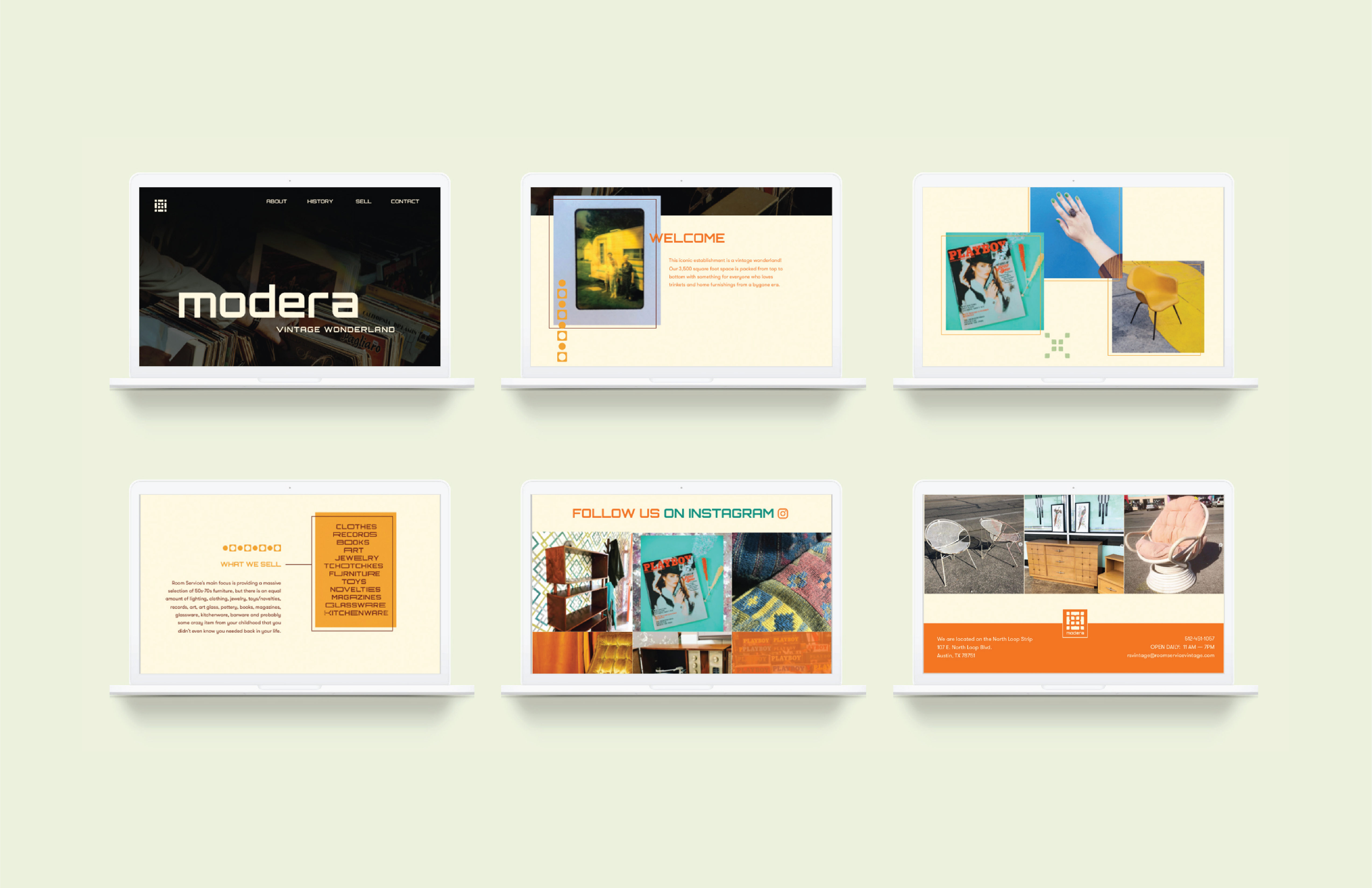
Modera is a vintage wonderland filled with 3,500 square feet of eclectic clothing, home decor, furniture, toys, jewelry, and other accessories. The store is primarily recognized for it’s massive selection of furniture from the 50’s to 70’s. Alongside furniture, there is an equal amount of lighting, novelties, pottery, books and magazines.
Brand Voice
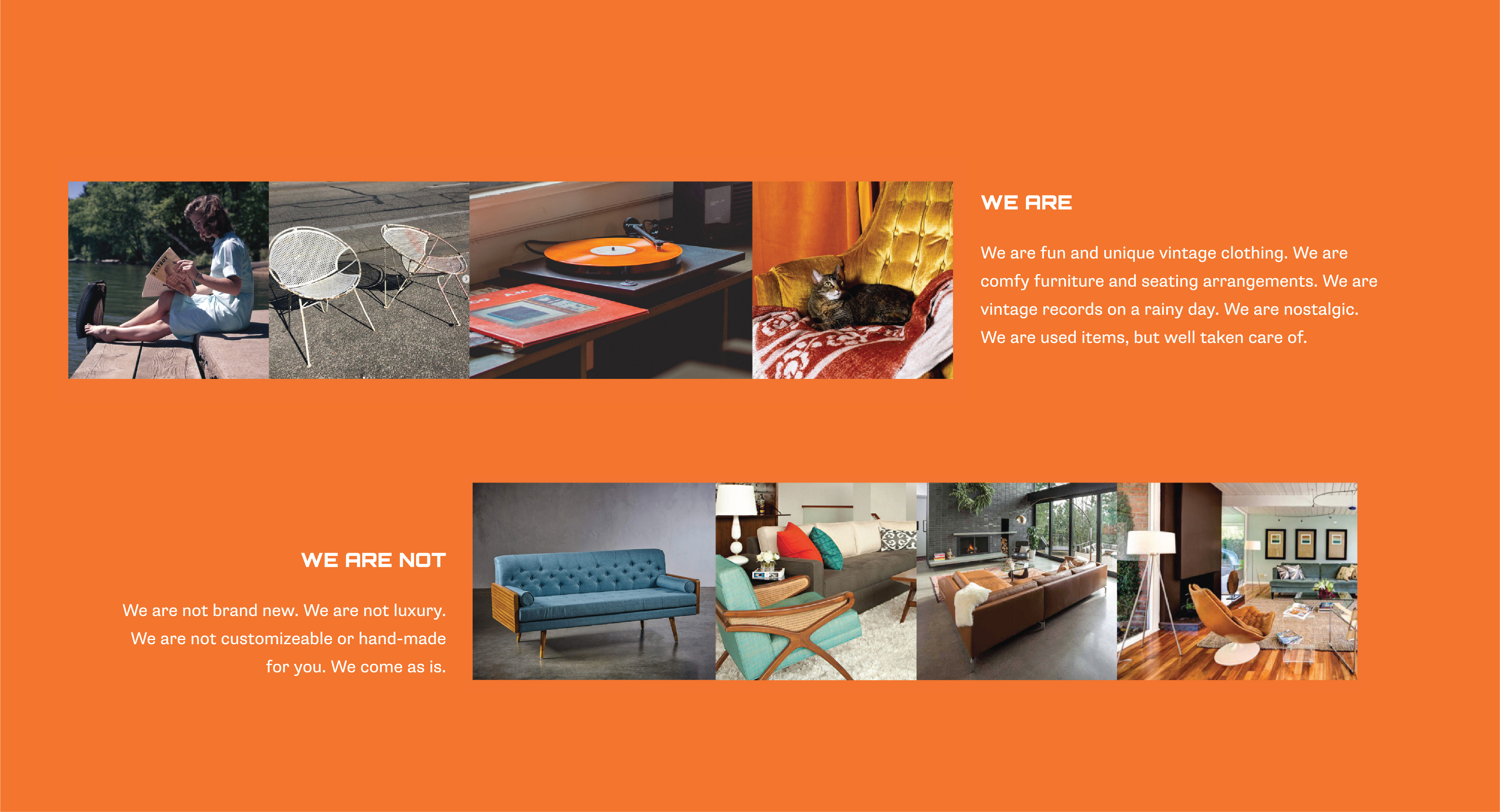
Easy Going
Approachable
Nostalgic
Trademark Design
Mood Board + Digital RoughsInspired by: Patterns and colors of the Mid-Century Modern era.
Approach: Create an abstract logo inspired by retro patterns that reflect the era most items in the store are from.

Mood Board + Digital Roughs
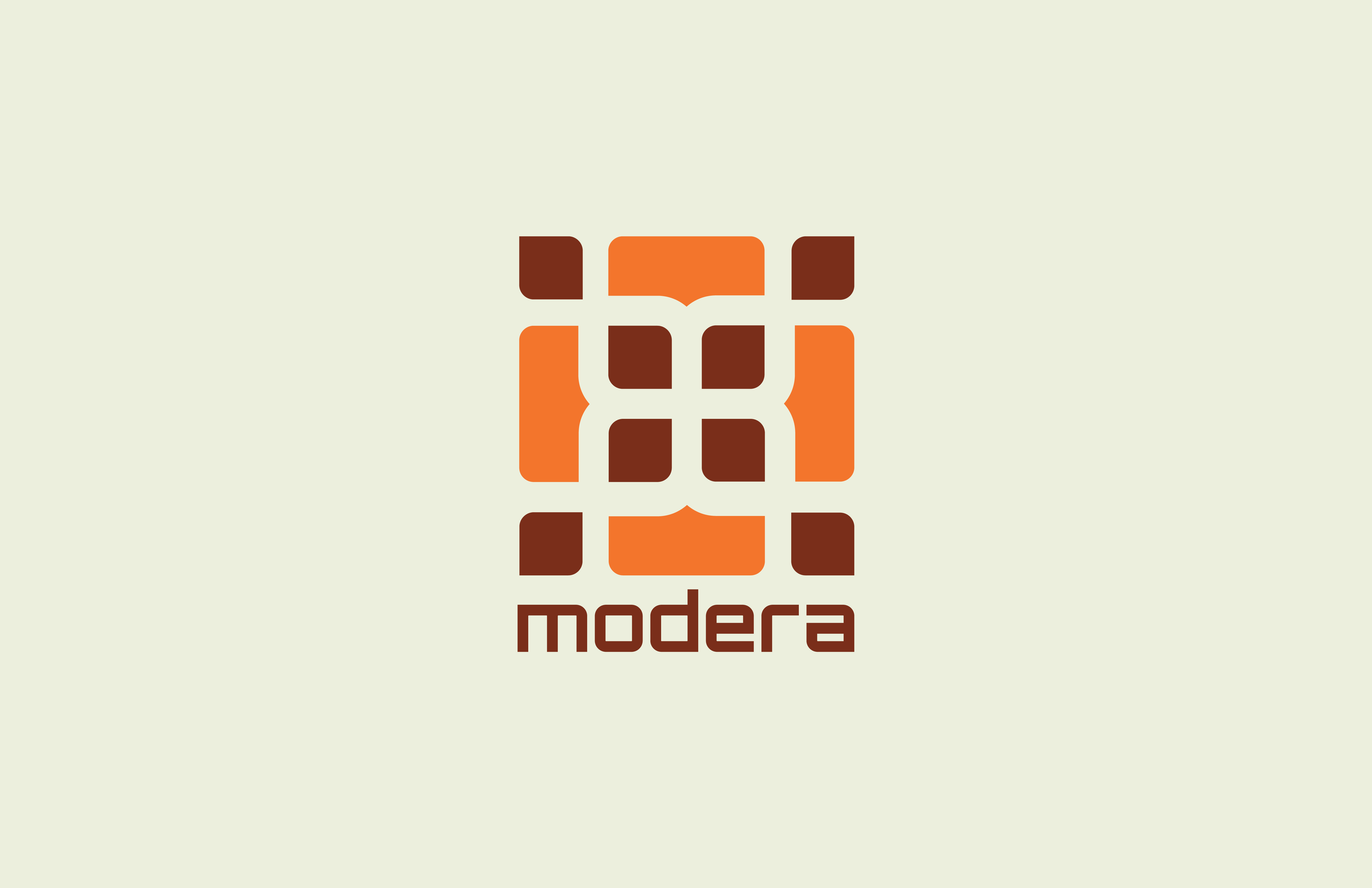
Final Trademark
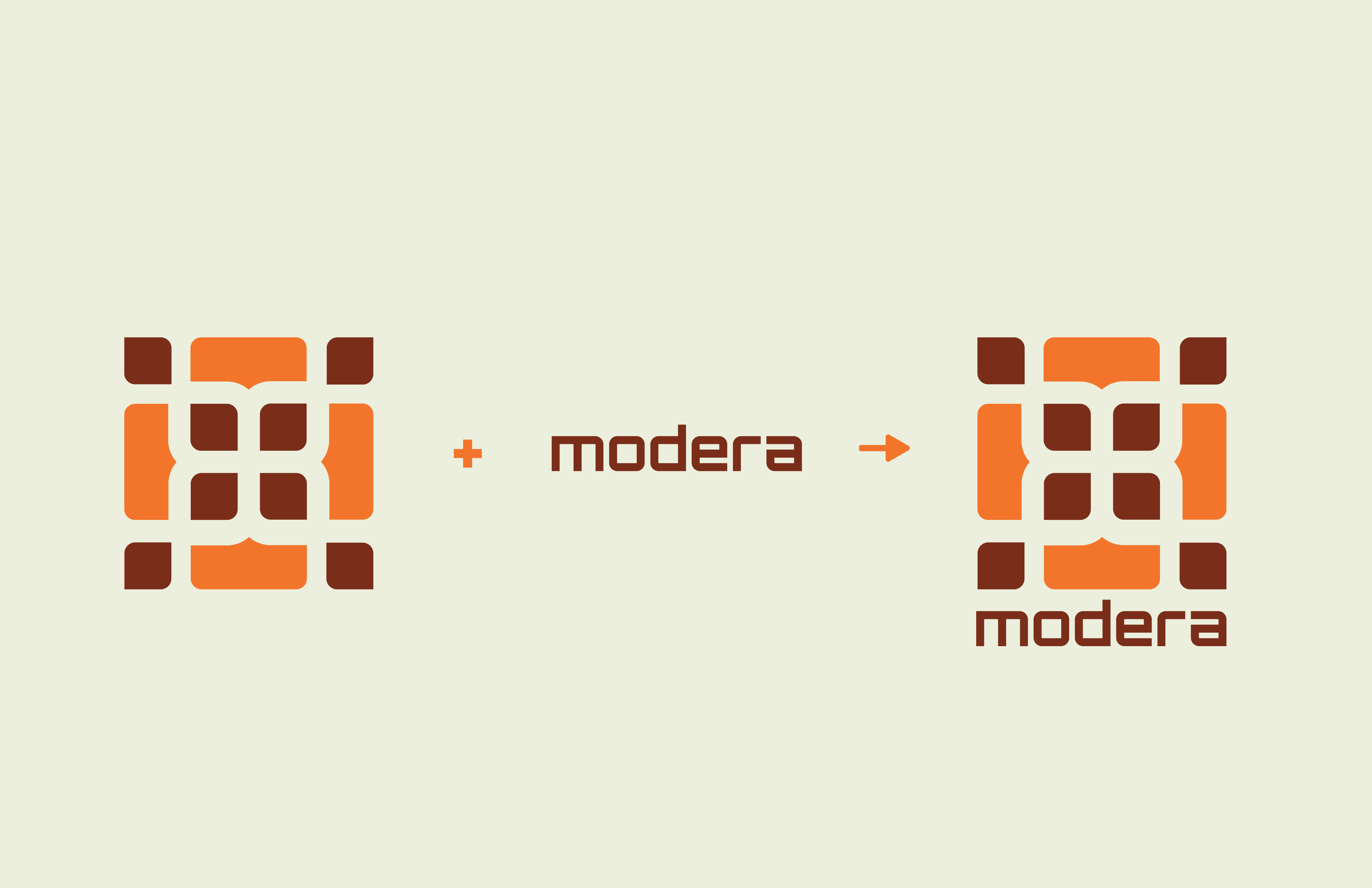
Logo + Wordmark + Final Trademark
Brand Guidelines
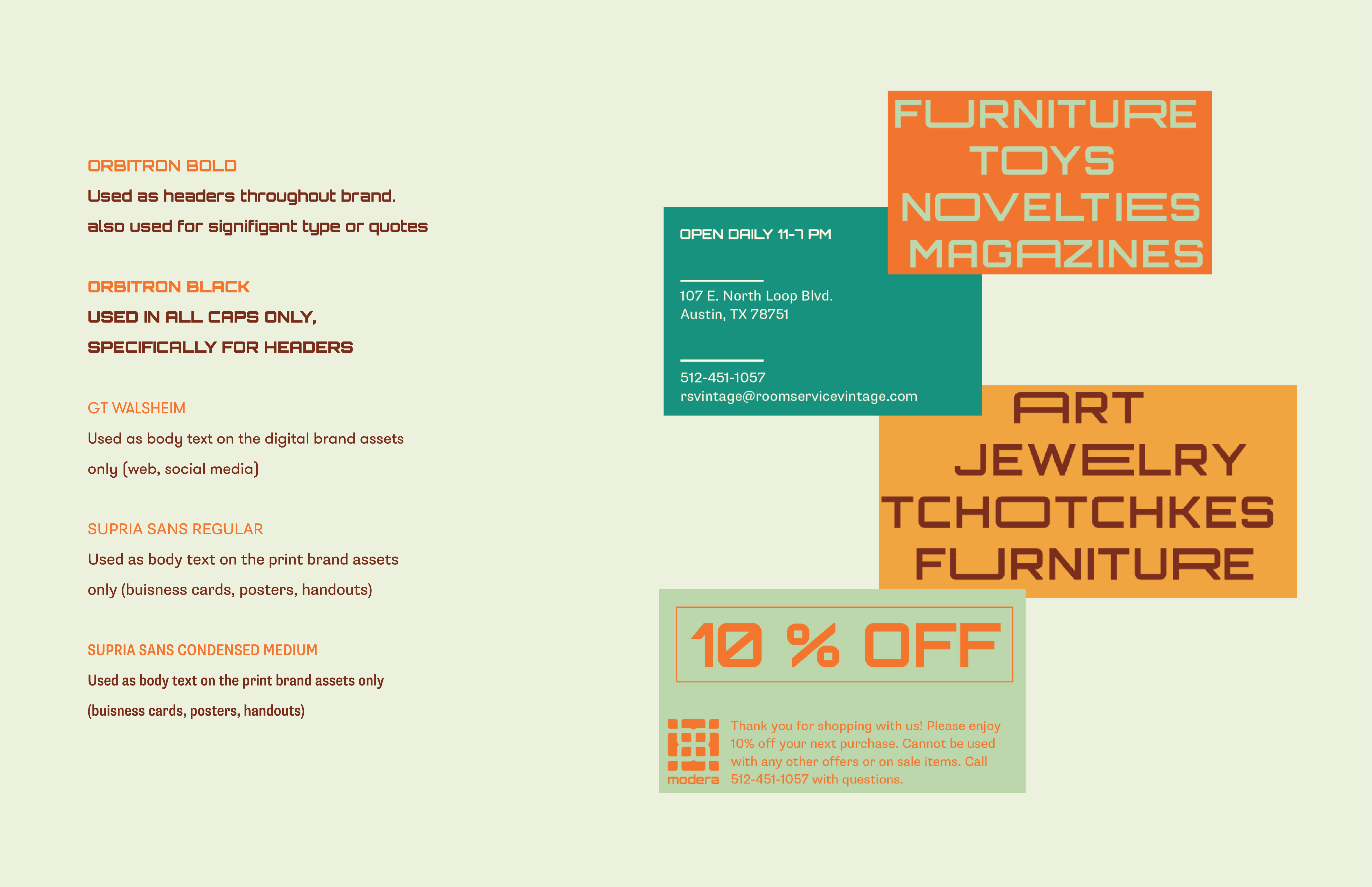
Color + Pattern + Type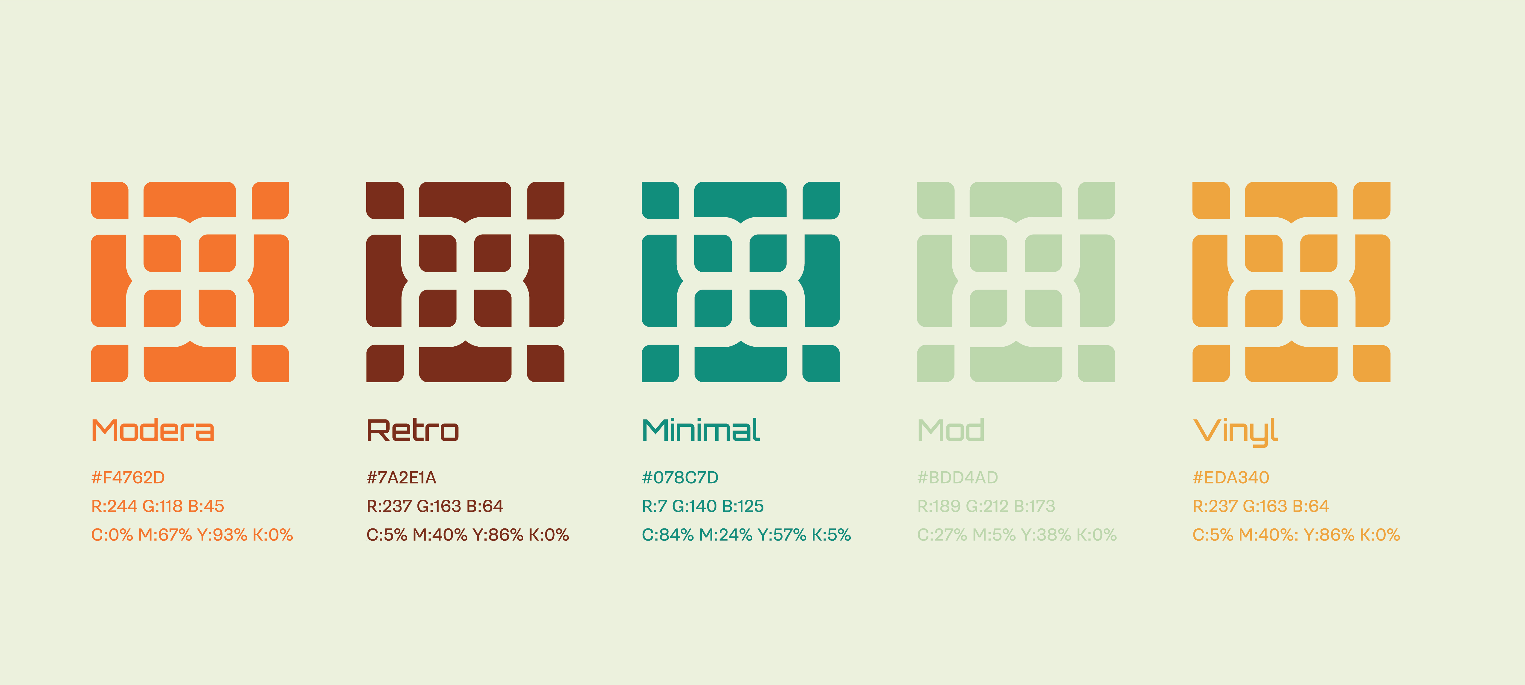
Color research was through Pinterest boards and articles based upon mid-century modern furniture and the aesthetic from that period.
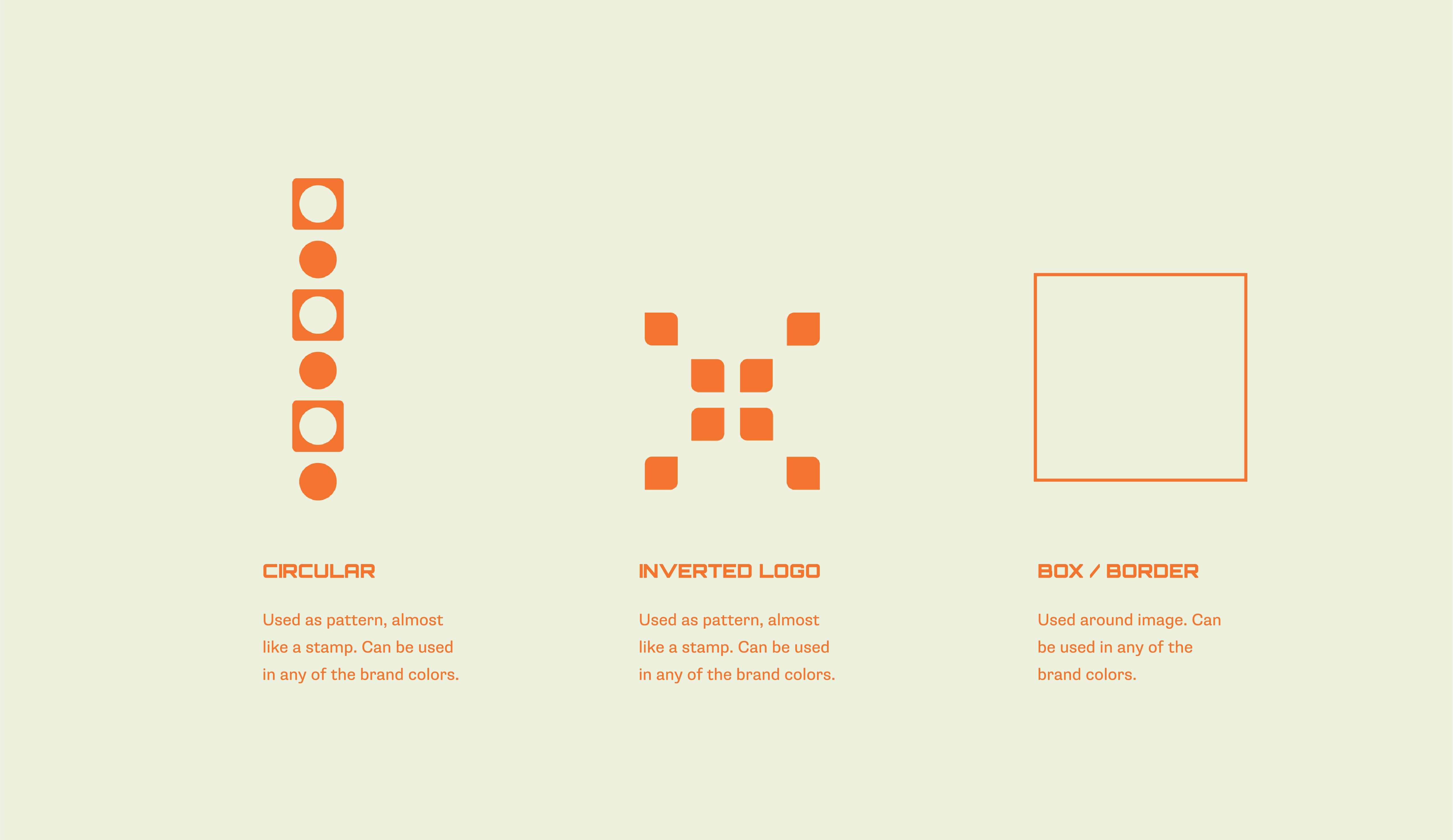
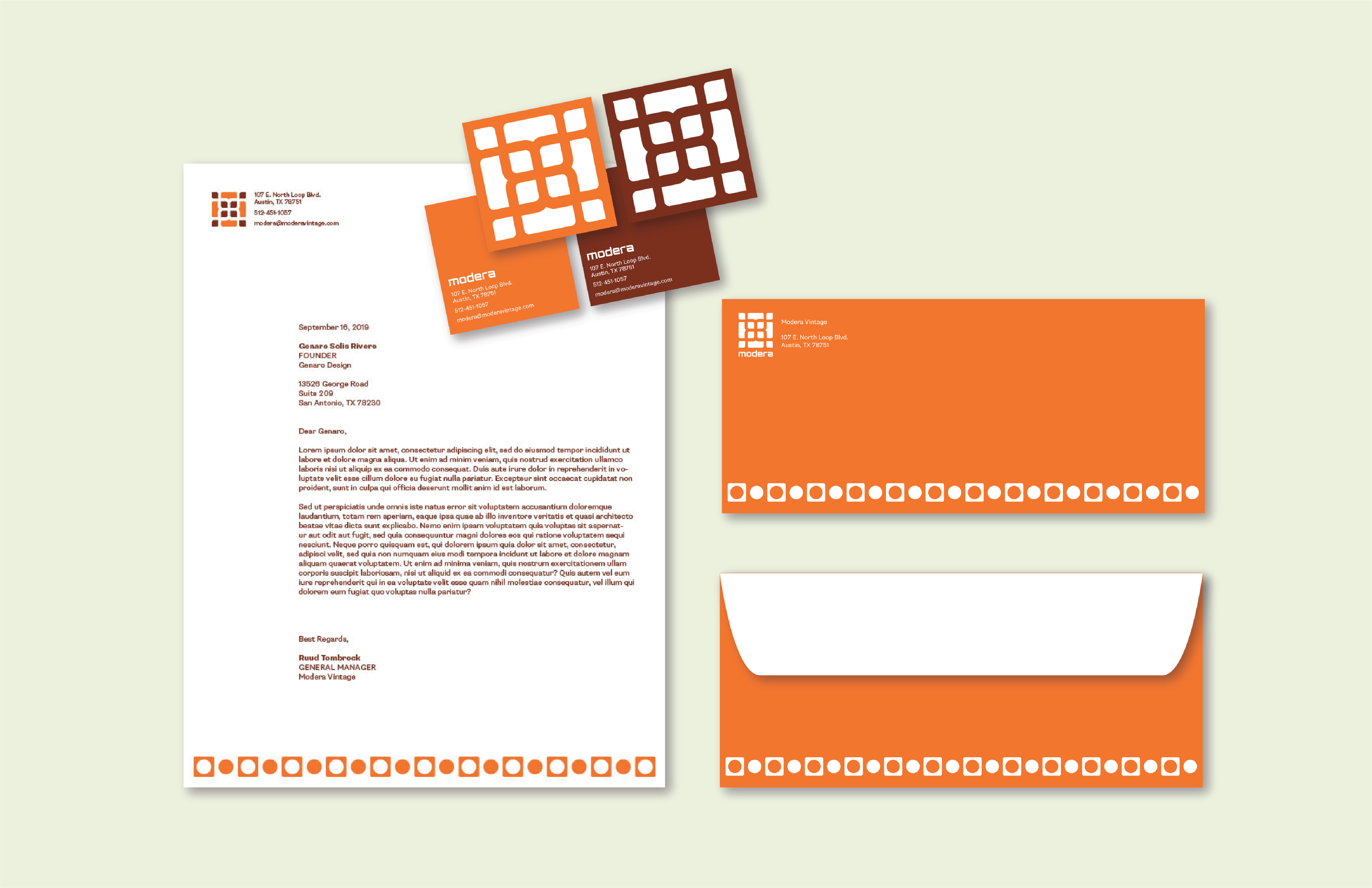
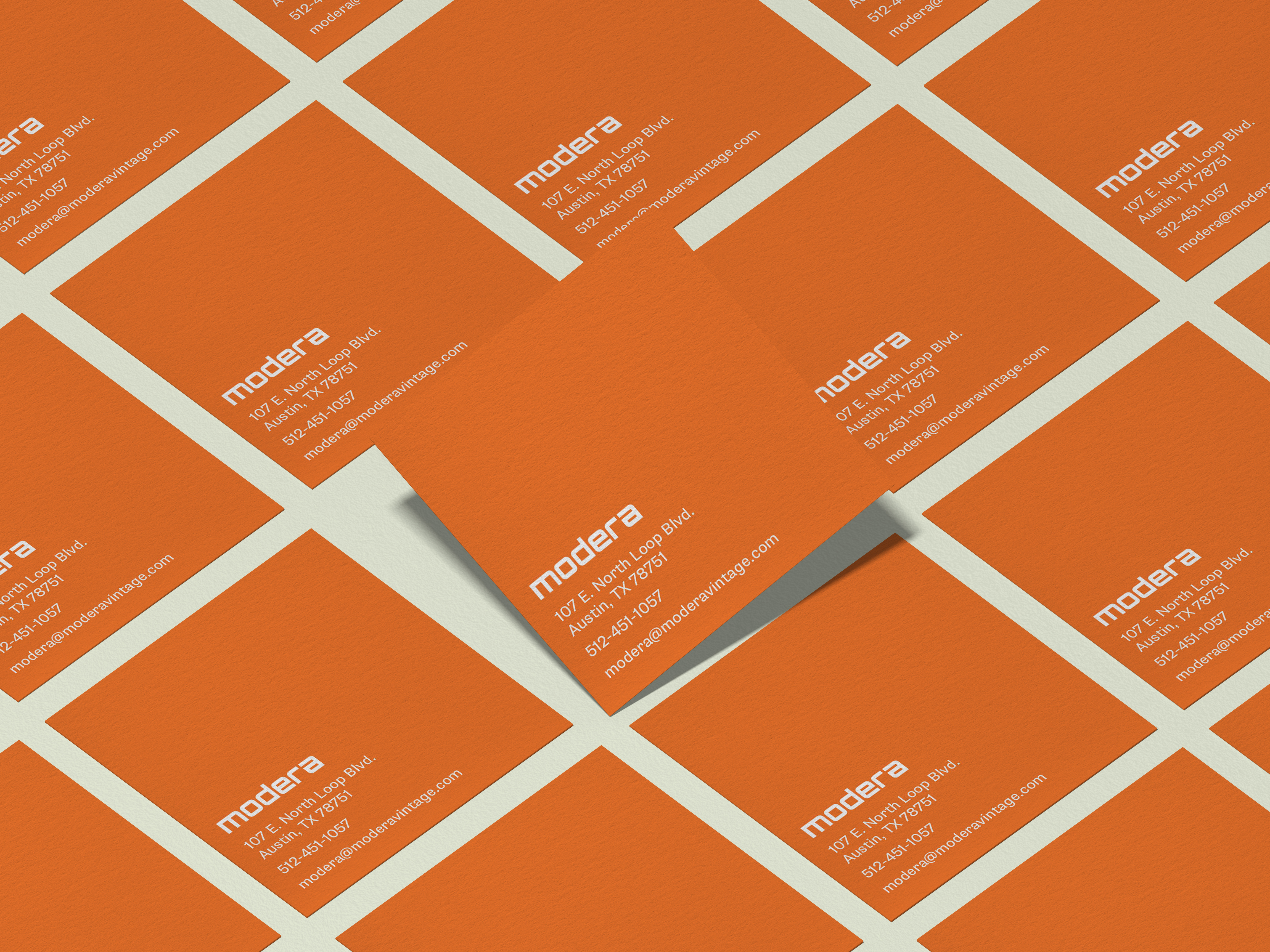
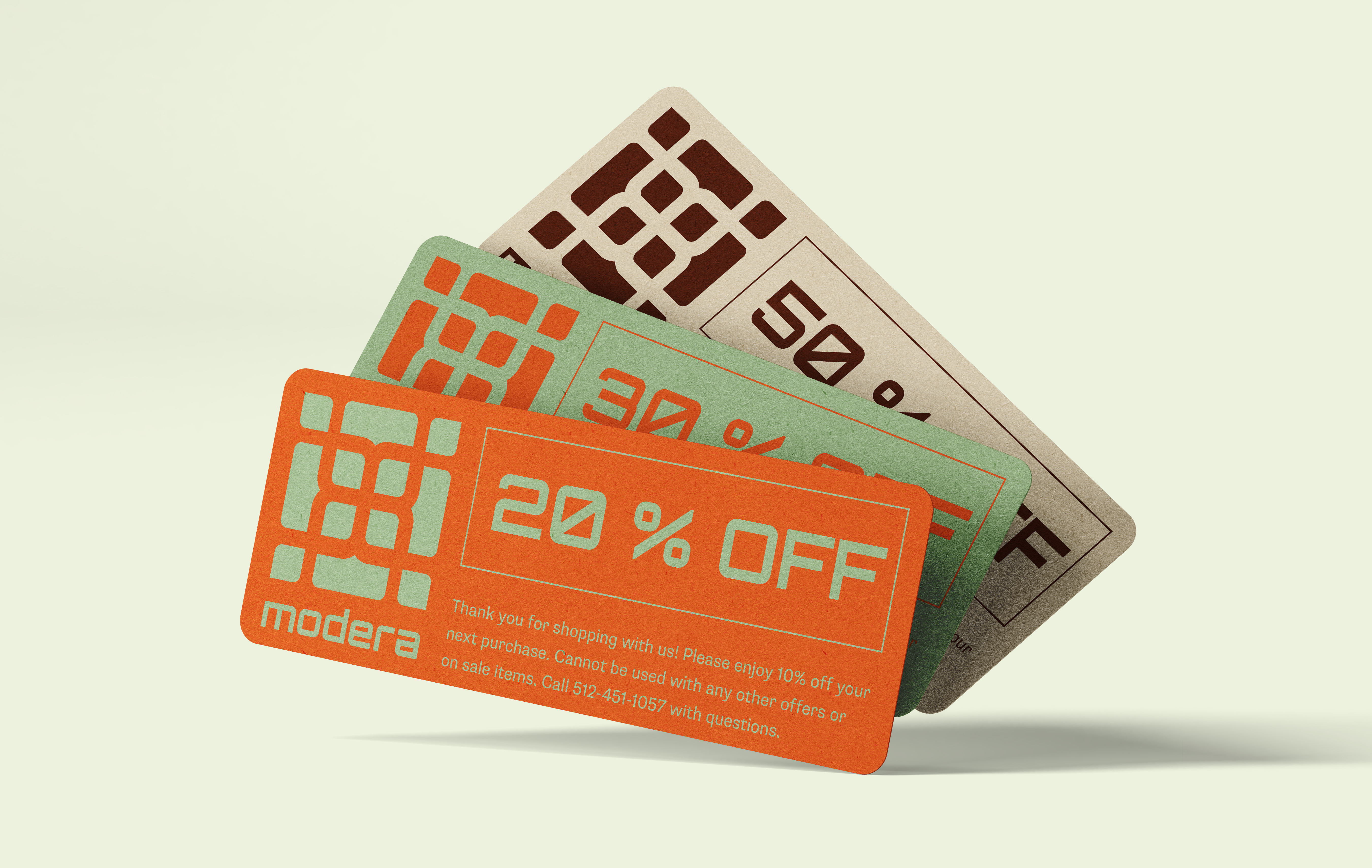
Brand Assets
Posters
Displayed at local hangouts, street corners, music venues and shopping areas.
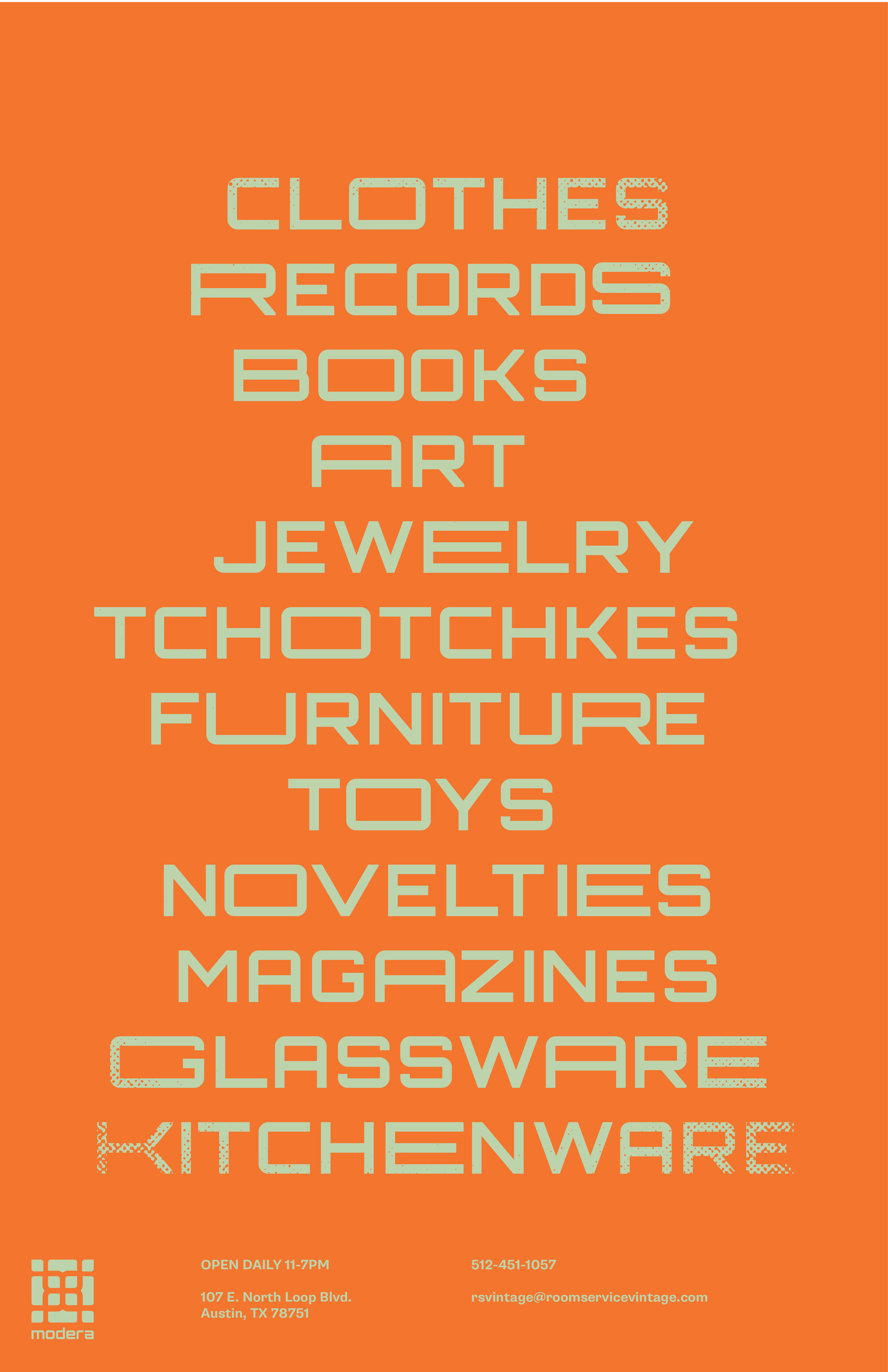
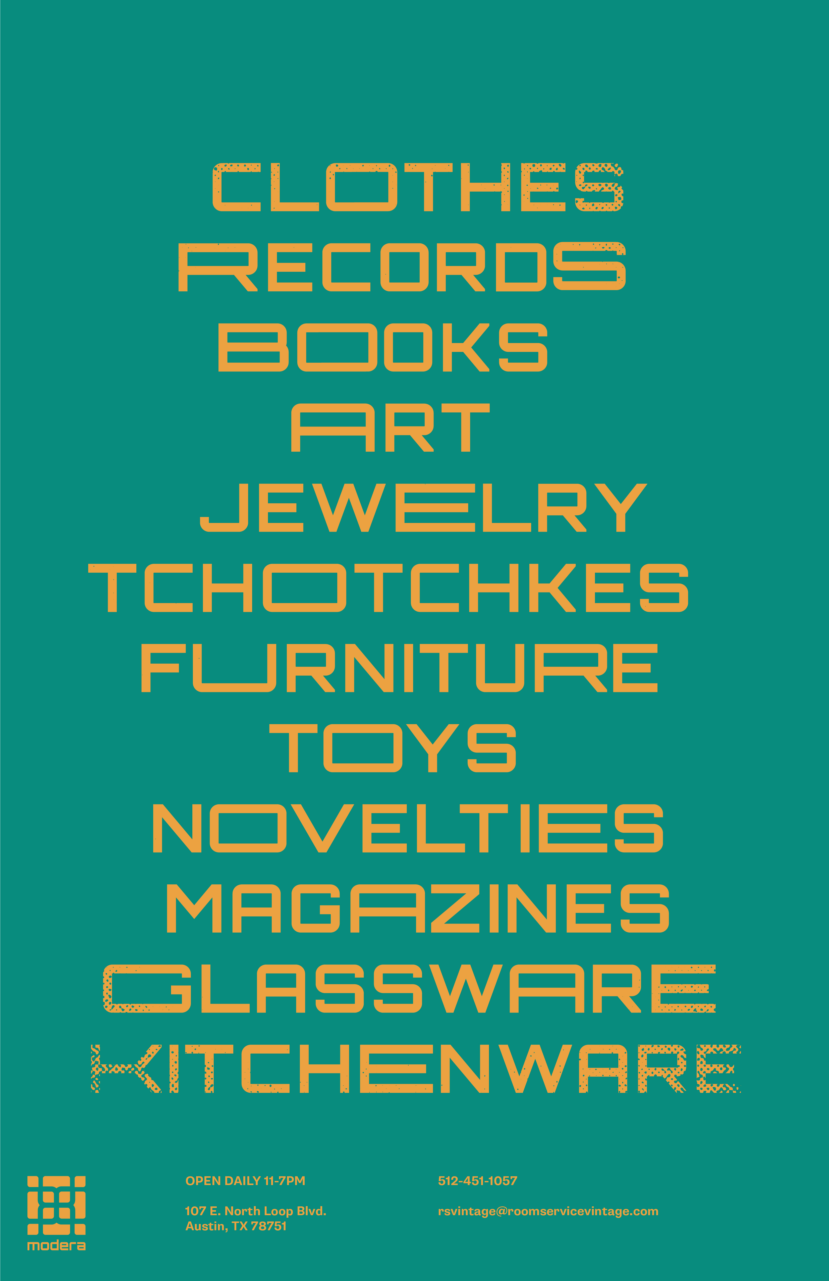
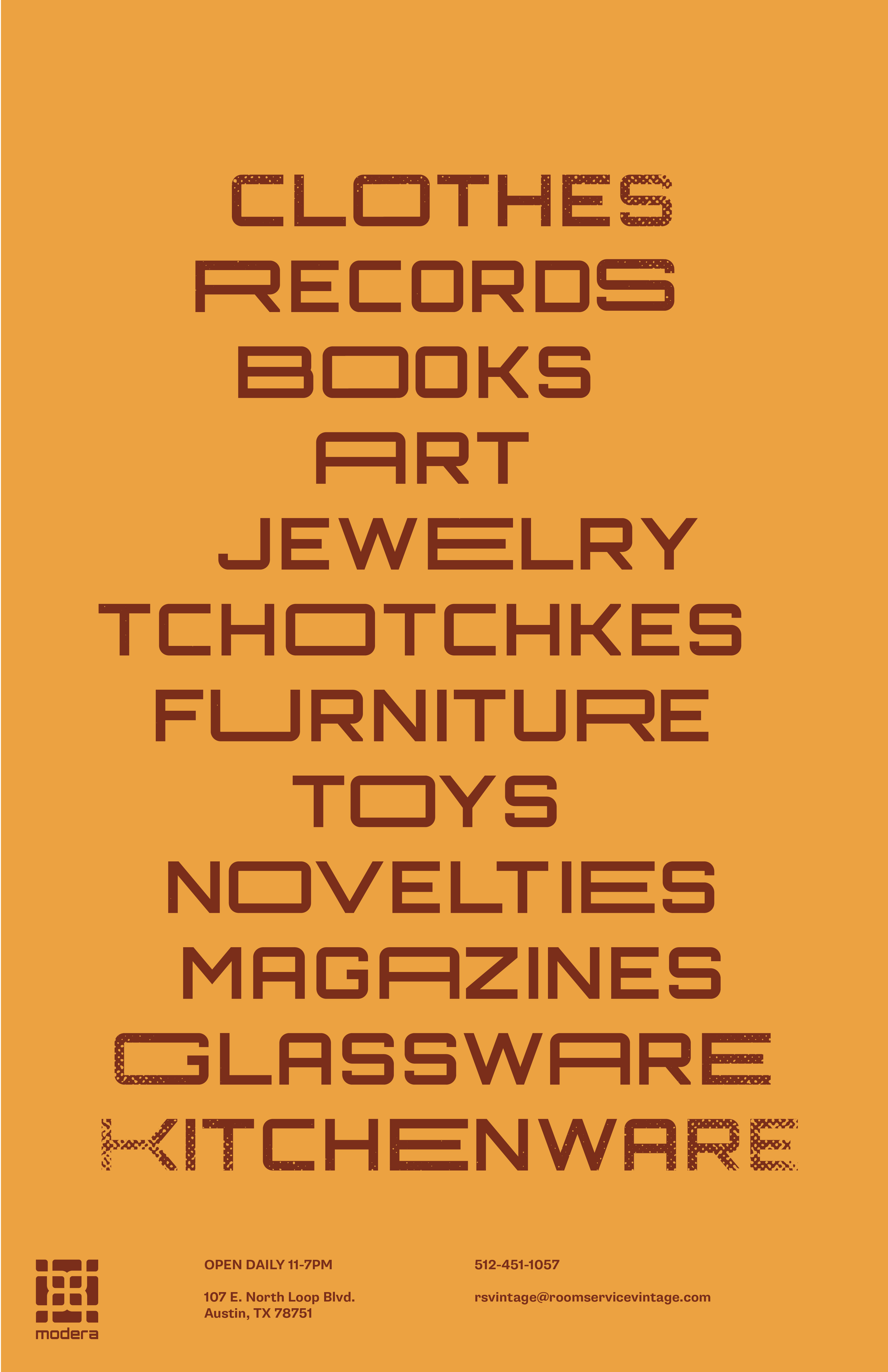

Inspired by stretched type and the unique, "quirky" nature of each letter being so different. This style hints at the unique and individuality of each piece at the store.
Handouts
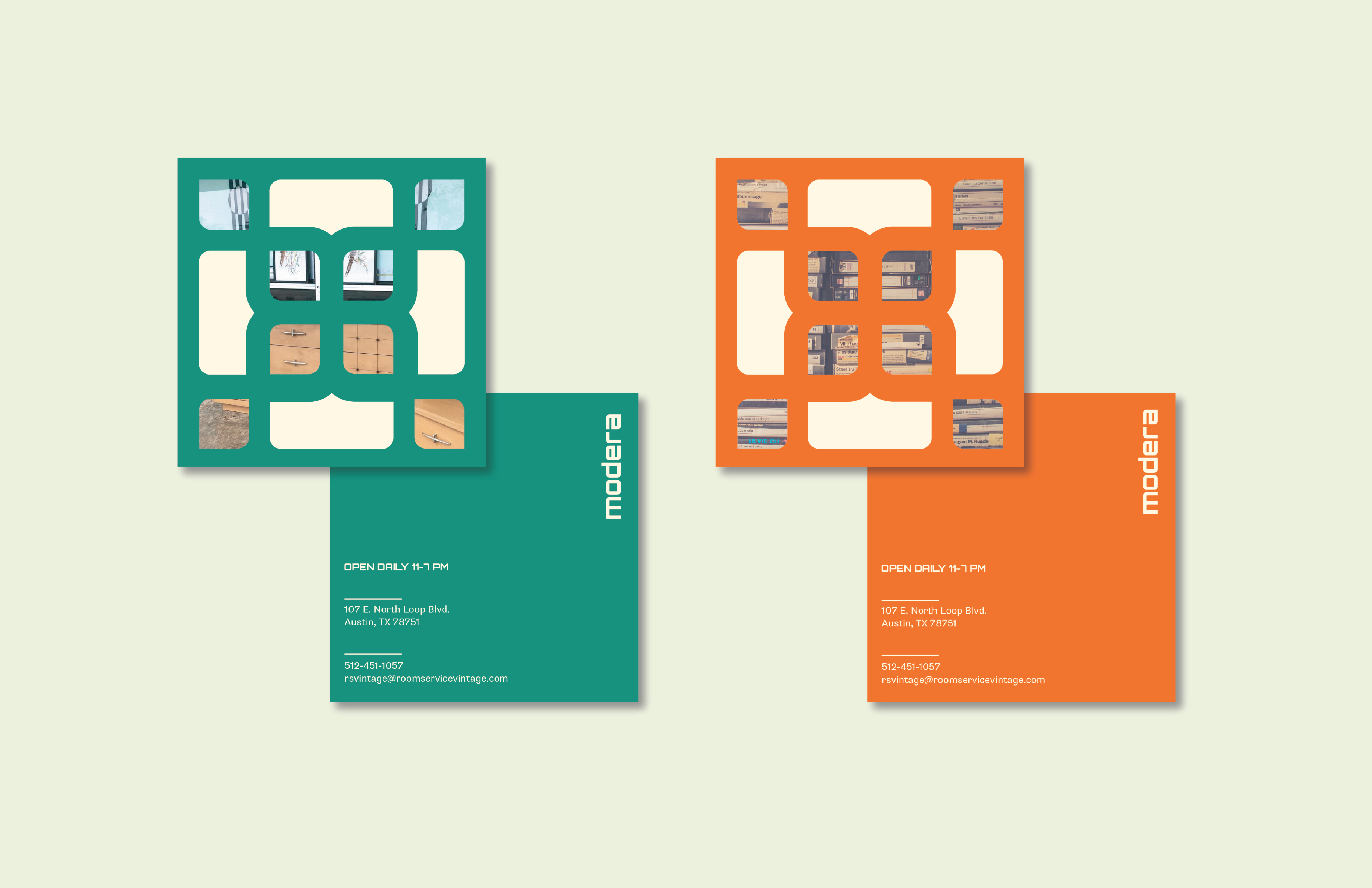
Square handouts given out at local events, posted on bulletin boards, to increase foot traffic in store.
Advertising
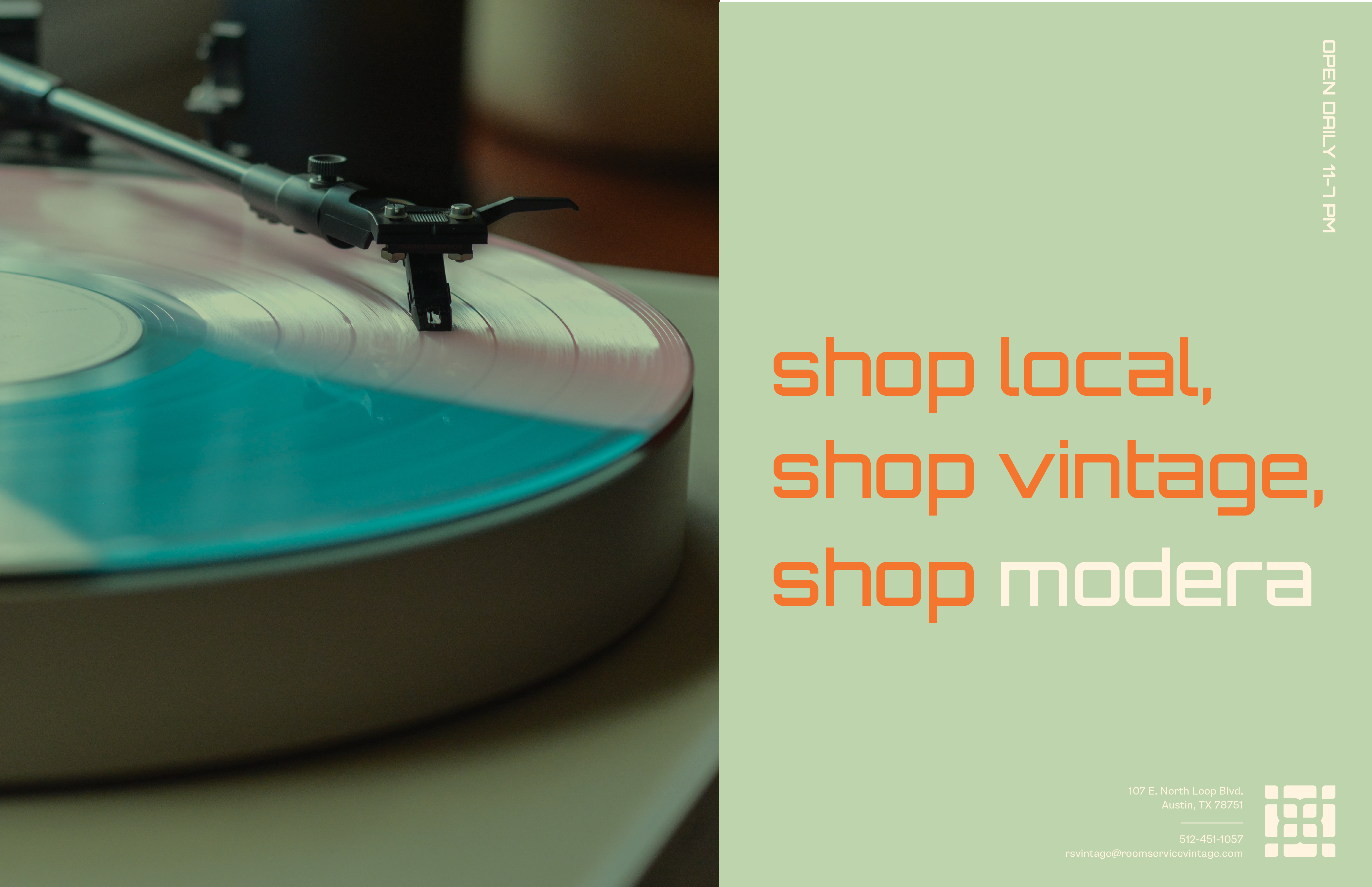
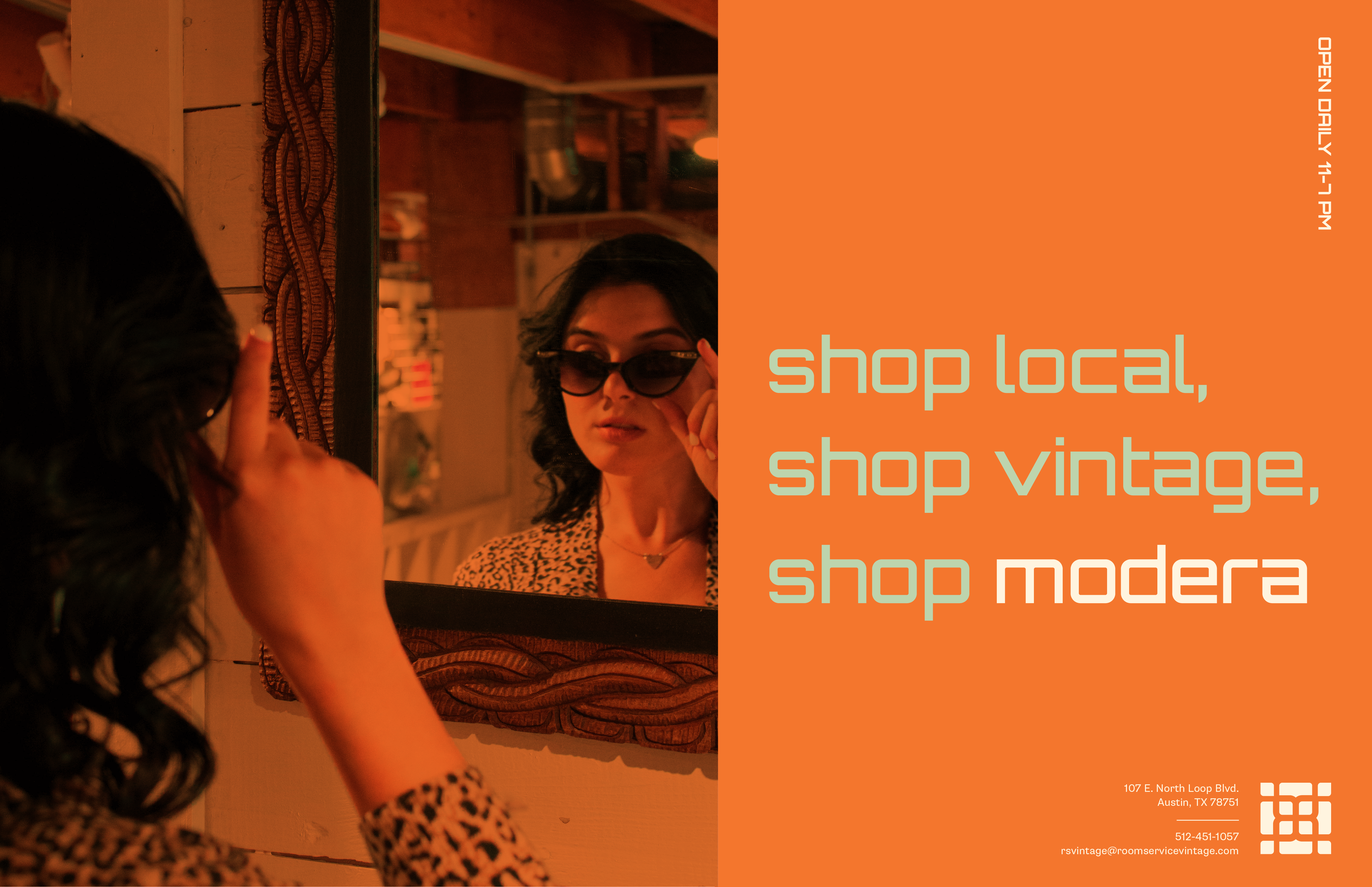

Shop Local is big statement that is especially popular in Austin with so many small and local businesses (food trucks, thrift stores, bakeries, etc.) Shop local, and shop vintage insinuate customers will be shopping local, while also shopping vintage (meaning used items)—a sense of recycling and purchasing something with history and a story. This copy creates a feeling that customers will do something beneficial by shopping local, shopping vintage, and shopping Modera!
Instagram Feed
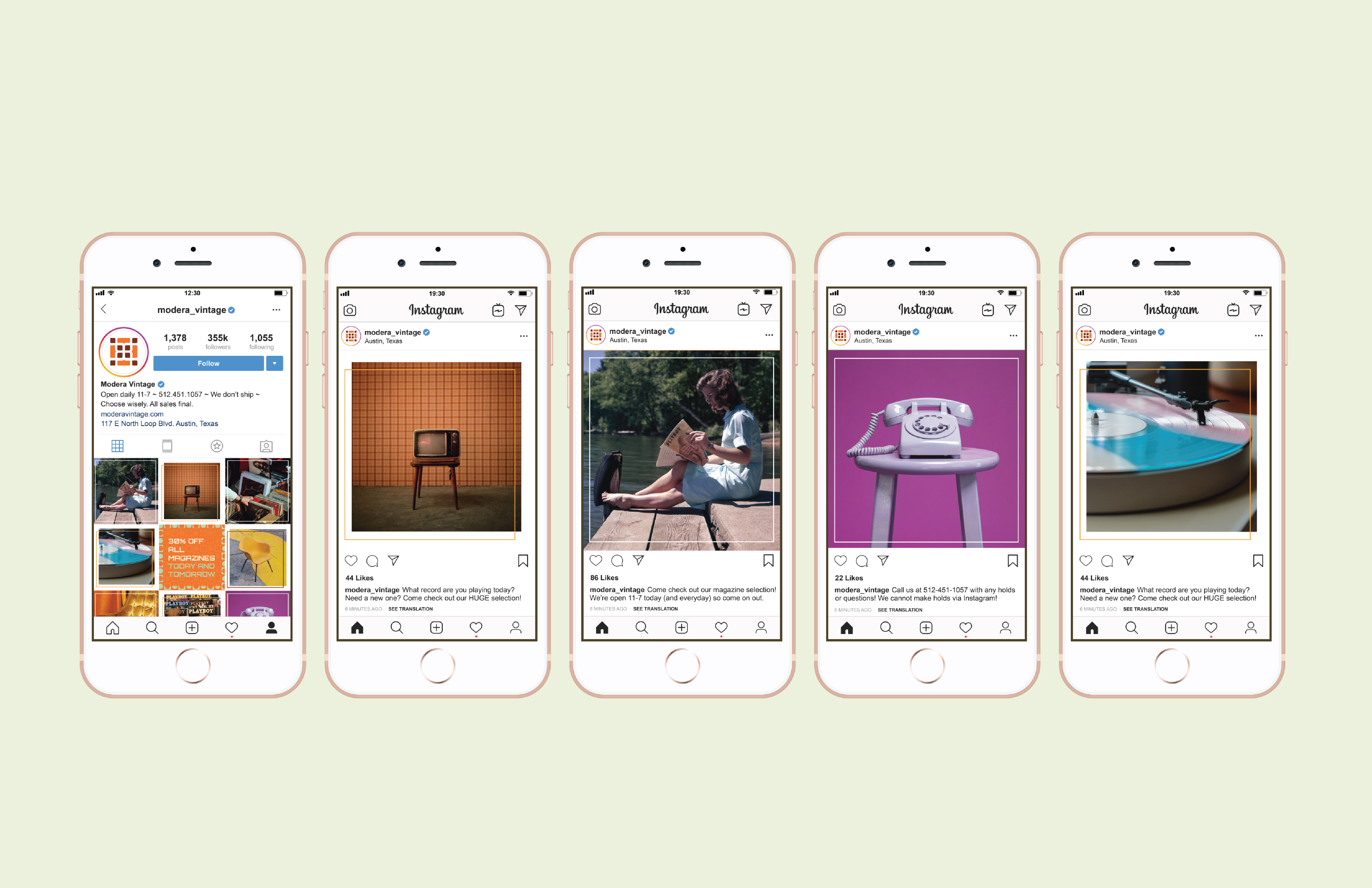 The 4 corner images on the Instagram grid are the centered outlined box, and the 4 cross corners are the off-center. This style creates a collage feel, something nostalgic like a scrapbook. The brand guide would show this interchangeable use (every other image) of the offset stroke, and the centered. Occasionally, there would be an advertisement (centered) which would be surrounded by both off-centered posts.
Website
